- Read Tutorial
- Watch Guide Video
- Complete the Exercise
Now that we have the HTML structure all in place, now let's start adding the styles.
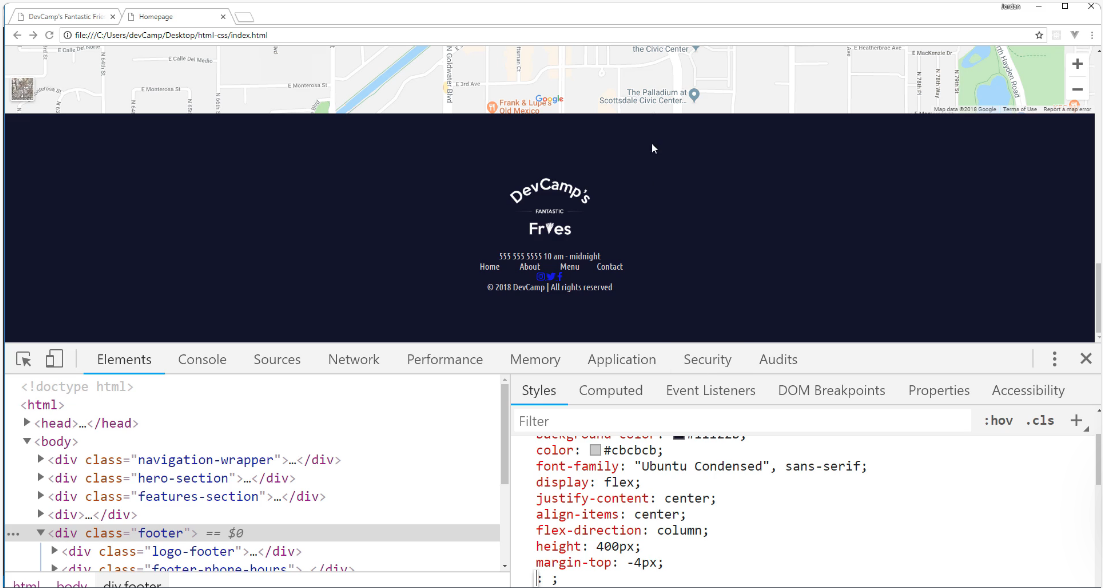
Right here you can see that we have a footer class wrapper right here, so this is going to be I think the best place to start.

I'm going to come into the common.css styles because these footer styles are going to be common and then we'll refactor it out into it's own little module later. I'm going to add in footer styles and we'll start off with our main footer class.
common.css
/* Footer styles */
.footer {
    background-color: #11122b;
    color: #cbcbcb;
    font-family: "Ubuntu Condensed", sans-serif;
}
Let's just see where we're at right now, so I'm going to switch back and hit refresh.

You can see we have our correct color, obviously, we need to style and format this logo because it's massive, it's just bringing it in with its full regular size but we have our correct fonts, we have our good background color so we are making progress.
Now that we have that, I think it's good to start aligning it. So we're going to use Flexbox to align this.
common.css
/* Footer styles */
.footer {
    background-color: #11122b;
    color: #cbcbcb;
    font-family: "Ubuntu Condensed", sans-serif;
    display: flex;
    justify-content: center;
    align-items: center;
}
If I hit save here and switch back and hit refresh, you're going to see that we aren't quite getting the behavior that you might expect.

Do you see how we have the logo here, then we have the hours and the phone number then the nav bar and everything is lined up horizontally? Well, this is something we have not discussed yet and this is what we're going to focus on in this guide.
By default, Flexbox uses what is called a row direction. So what that means is that if you do not tell Flexbox any different, it will take all of the divs that are nested inside and then it will just line them up side by side.
It assumes that you want to set them up with this column kind of layout. Now what I'm going to say may sound a little bit weird and I personally when I was learning Flexbox I thought the naming was a little bit different, it felt like it was opposite and it took a little while to memorize it.
The default direction that we use here is called the row direction. So Flexbox uses this and it calls this a row and in their minds, in the developers of Flexbox, what they believe is that they're saying that they're placing all the content on a single row.
I personally think they look like columns, but they say this is one single row. What we wanna do is to use a custom value for the direction and so we wanna say that we want to use a column and that column direction is going to allow us to stack the elements on top of each other.
Let's do it right here I'm going to click on footer with our inspector and come into our browser tools. I'm going to say flex direction and you can see the options, we have column, we have column reverse, we have inherit initial, row, row reverse and unset.

Well if we click on column, you'll see that that actually gets us what we're wanting. So this is the correct way to use flex direction. Whenever you have a set of divs, so all the child elements are items that you want to stack on top of each other, use flex direction column.
That's what we're going to do here, I'll just copy this, switch back and then we'll paste that in and fix the indentation. So now that we have that, let's also declare a height, I wanna use 400 pixels for the height and let's just see what that gives us.
common.css
/* Footer styles */
.footer {
    background-color: #11122b;
    color: #cbcbcb;
    font-family: "Ubuntu Condensed", sans-serif;
    display: flex;
    justify-content: center;
    align-items: center;
    flex-direction: column;
    height: 400px;
}
Okay, so now if we hit refresh, that is kind of working, this image is throwing it off though.

Let's go and let's fix this image before we do anything else. So now let's grab the footer and then I believe I called the class logo-footer.
common.css
/* Footer styles */
.footer > .logo-footer img {
    width: 180px;
    height: 100%;
}
That should fix this little distortion issue. and as you can see that is now working nicely. We obviously still have some work to do on the styling, but this is giving us the size we want.

Now there's one other little thing here that's bugging me a little bit and so let's zoom in. So do you see how we have, and it's kinda hard to see on the screen but you notice how there's a little bit of a white border around the map? I do not like that, I want that to go away and the map to be flush.
There are a couple ways we can do that but I think this is a good example of where we can use a negative margin.
If I select the footer here and what I'm going to tell you to do is something that you don't want to do a lot but there definitely are times to do it and you will run into plenty of situations where you see this so I wanted to teach it to you.
And that is that usually when you're using margin, you're using it to add some space, to add some margin. But you also have the ability to use a negative margin.
If I say here with the footer class we want the margin-top to be negative four pixels, do you see how that gets rid of that white border right there and that gives us more of what we're looking for so it's nice and flush?
Let me copy this.
common.css
/* Footer styles */
.footer {
    background-color: #11122b;
    color: #cbcbcb;
    font-family: "Ubuntu Condensed", sans-serif;
    display: flex;
    justify-content: center;
    align-items: center;
    flex-direction: column;
    height: 400px;
    margin-top: -4px;
}
Now go back to the browser. This should give us all of the footer styles that we're going to need, at least for the wrapper. So if I hit refresh, everything here is working properly.
In this guide, we walked through a number of new skills, we talked about things like negative margin, but one of the most important things I want you to take away from this specific video is that you have the ability with Flexbox to change how all of the elements are rendered.
Let me just show you a few of the other options. So we have column but you remember how we had column reverse? Well if you ever have a situation where you're getting some divs in and you wanna reverse the value, you do have the ability to do that.
If you don't list your flex direction, then row works automatically. But if you want to reverse those items you can reverse them just like that, which is pretty cool, and there are a few times where I have had to do that, so it's good to understand it.
But the two values I use the most for flex direction are going to be the default one, which is just going to be your basic row, and then column. This is what you wanna do whenever you wanna have the elements stacked on top where every one of the divs is going to be its own row.
Once again, I think that their naming is a little unfortunate because when I was learning it I like to think of columns as items that are stacked right next to each other, but that is the way they named it. The best way to work through it and understand it is really just to practice it a few times.
So I definitely recommend not only to implement this but also to see how you can play with a few of those other values just so it can become more ingrained.